Set Color by Group in ggplot2 Plot in R (4 Examples) | Line, Point & Box
Set Color by Group in ggplot2 Plot in R (4 Examples)
On this page, I’ll show how to specify different group colors in a ggplot2 graph in the R programming language.
The content of the post looks like this:
Let’s dig in:
Example Data, Packages & Default Plot
As a first step, we’ll need to construct some data that we can use in the examples later on:
set
.
seed
(
68117534
)
# Set random seed
data<-
data.
frame
(
x=
1
:
15
,# Create example data frame
y=
c(
runif(
15
,0
,2
)
, runif(
15
,2
,6
)
, runif(
15
,3
,4
)
, runif(
15
,1
,3
)
)
,group
=
rep(
LETTERS[
1
:
4
]
, each=
15
)
)
head(
data)
# Print head of example data frame
set.seed(68117534) # Set random seed
data <- data.frame(x = 1:15, # Create example data frame
y = c(runif(15, 0, 2),
runif(15, 2, 6),
runif(15, 3, 4),
runif(15, 1, 3)),
group = rep(LETTERS[1:4], each = 15))
head(data) # Print head of example data frame
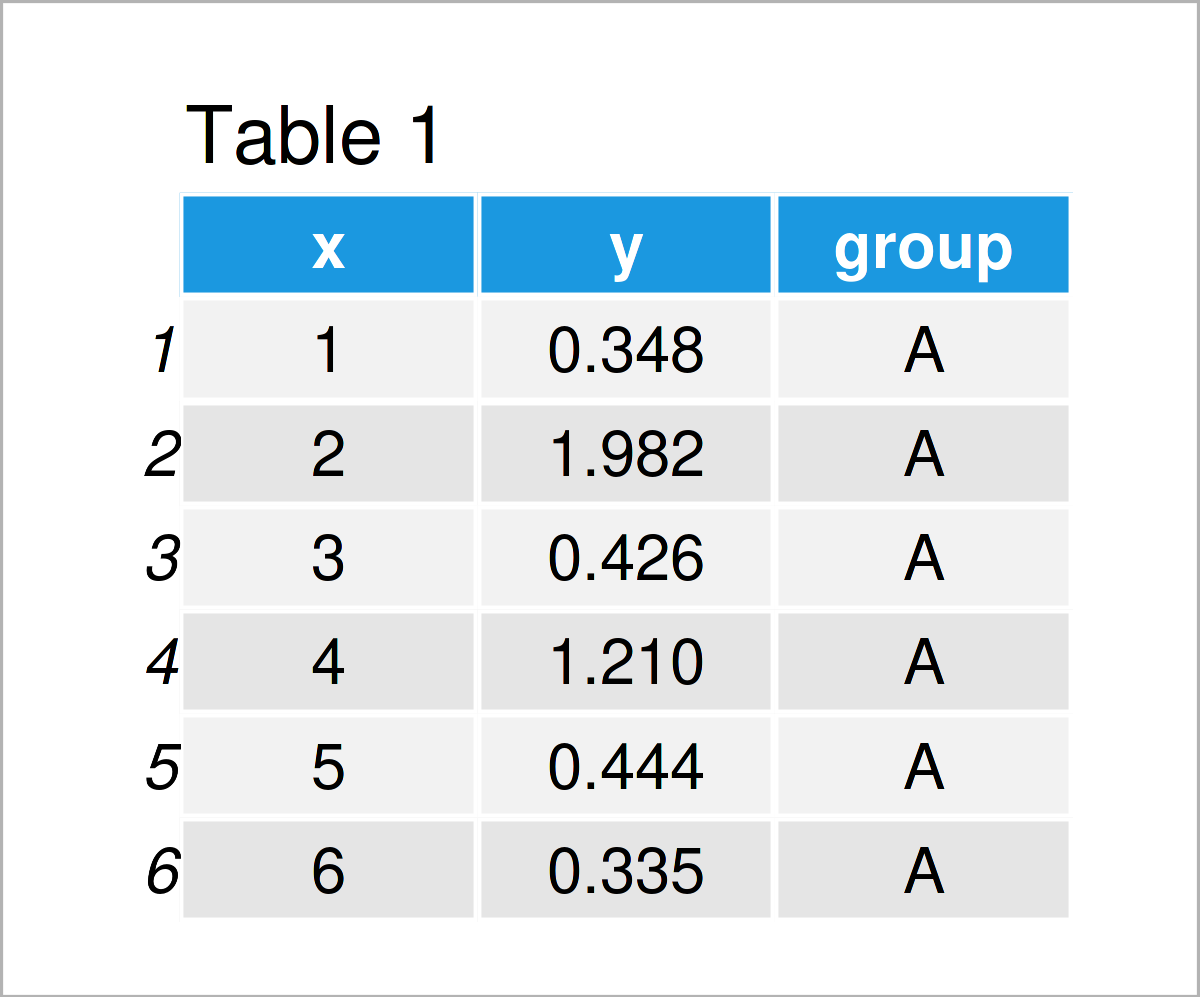
Table 1 shows the first six rows of our example data: it is also shown that the data contains three columns.
For the examples of this tutorial, I’ll also need to install and load the ggplot2 package to RStudio:
install.
packages
(
"ggplot2"
)
# Install & load ggplot2 package
library(
"ggplot2"
)
install.packages(“ggplot2”) # Install & load ggplot2 package
library(“ggplot2”)
As a next step, we can plot our data without colors:
ggplot(
data,# Draw ggplot2 plot without colors
aes(
x=
x, y=
y,group
=
group
)
)
+
geom_line(
)
+
geom_point(
)
ggplot(data,                    # Draw ggplot2 plot without colors
       aes(x = x,
           y = y,
           group = group)) +
  geom_line() +
  geom_point()
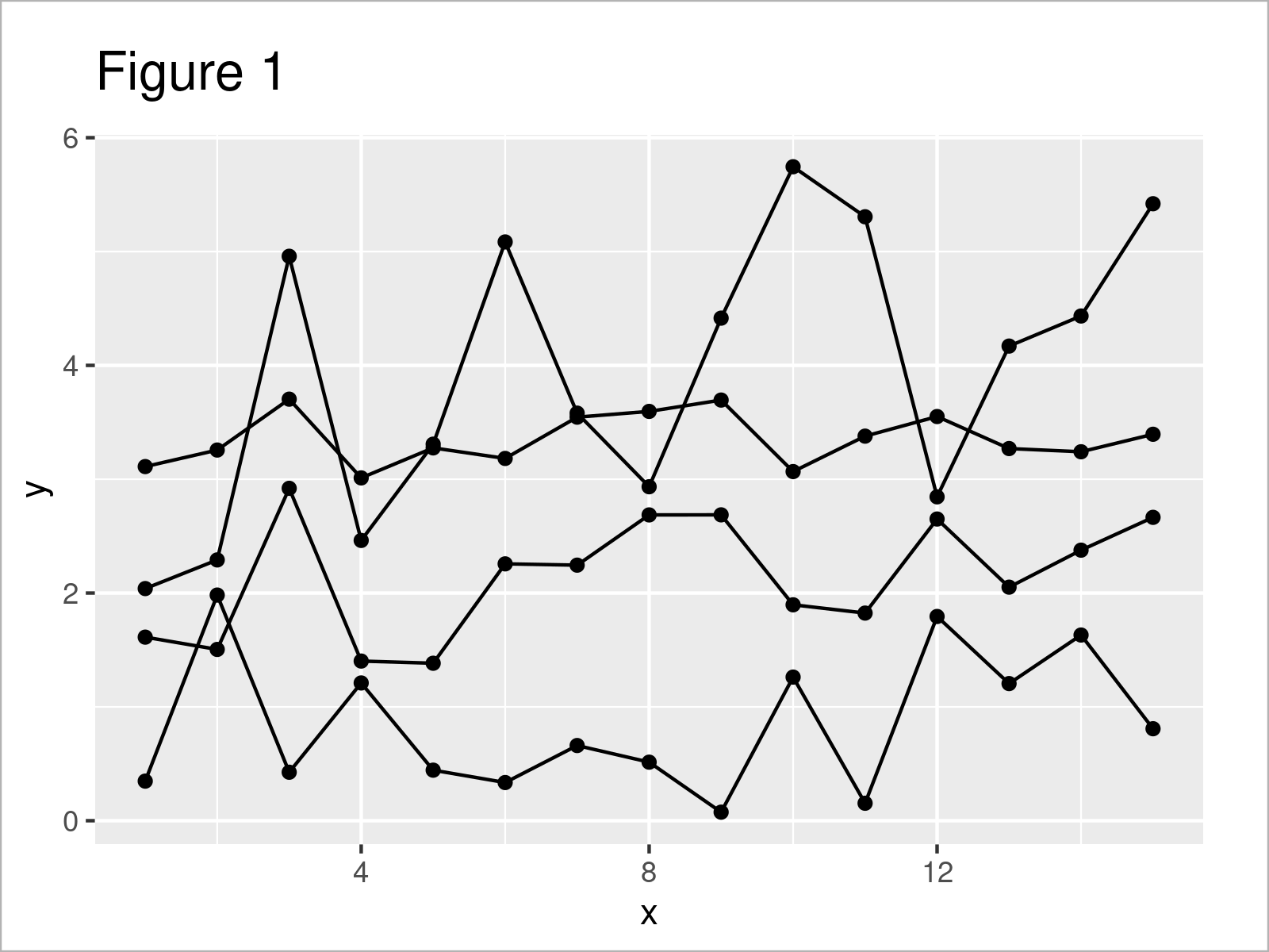
By executing the previously shown R programming syntax, we have drawn Figure 1, i.e. a ggplot2 line and point graphic without any colors.
Example 1: Modify Colors of Single Geom by Group
Example 1 shows how to adjust the colors in a ggplot2 plot by group for a single geom.
In this specific example, we are changing the line colors of our plot:
ggplot(
data,# Change colors of lines by group
aes(
x=
x, y=
y,group
=
group
)
)
+
geom_line(
aes(
col=
group
)
)
+
geom_point(
)
ggplot(data,                    # Change colors of lines by group
       aes(x = x,
           y = y,
           group = group)) +
  geom_line(aes(col = group)) +
  geom_point()
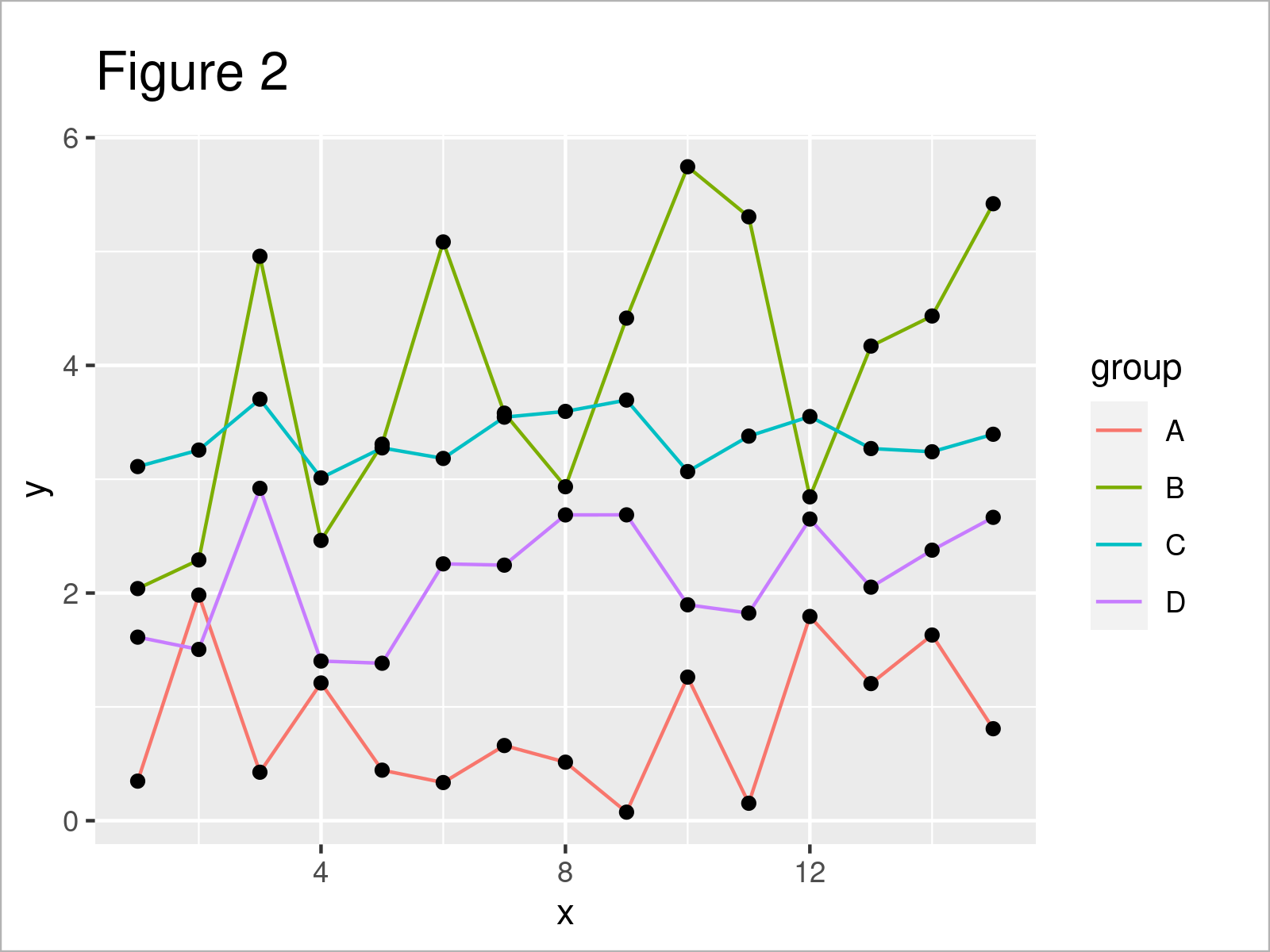
Figure 2 shows the output of the previous syntax: We have adjusted the line colors. However, the color of the points has been kept the same.
Example 2: Modify Colors of All Geoms by Group
It is also possible to change all colors according to the groups in a data set.
To achieve this, we have to specify the col argument within the aesthetics of the ggplot function:
ggplot(
data,# Change colors of lines & points by group
aes(
x=
x, y=
y, col=
group
)
)
+
geom_line(
)
+
geom_point(
)
ggplot(data,                    # Change colors of lines & points by group
       aes(x = x,
           y = y,
           col = group)) +
  geom_line() +
  geom_point()
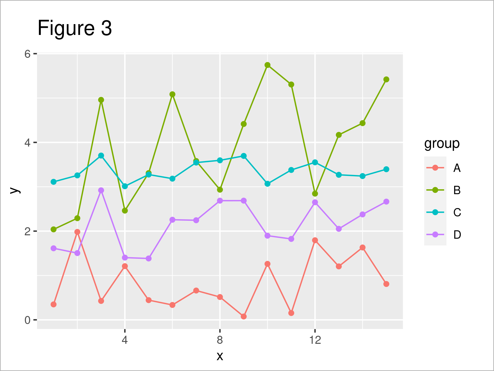
As shown in Figure 3, the previous code has created a new ggplot2 plot where all colors have been changed by group.
Example 3: Using Manual Color Codes by Group
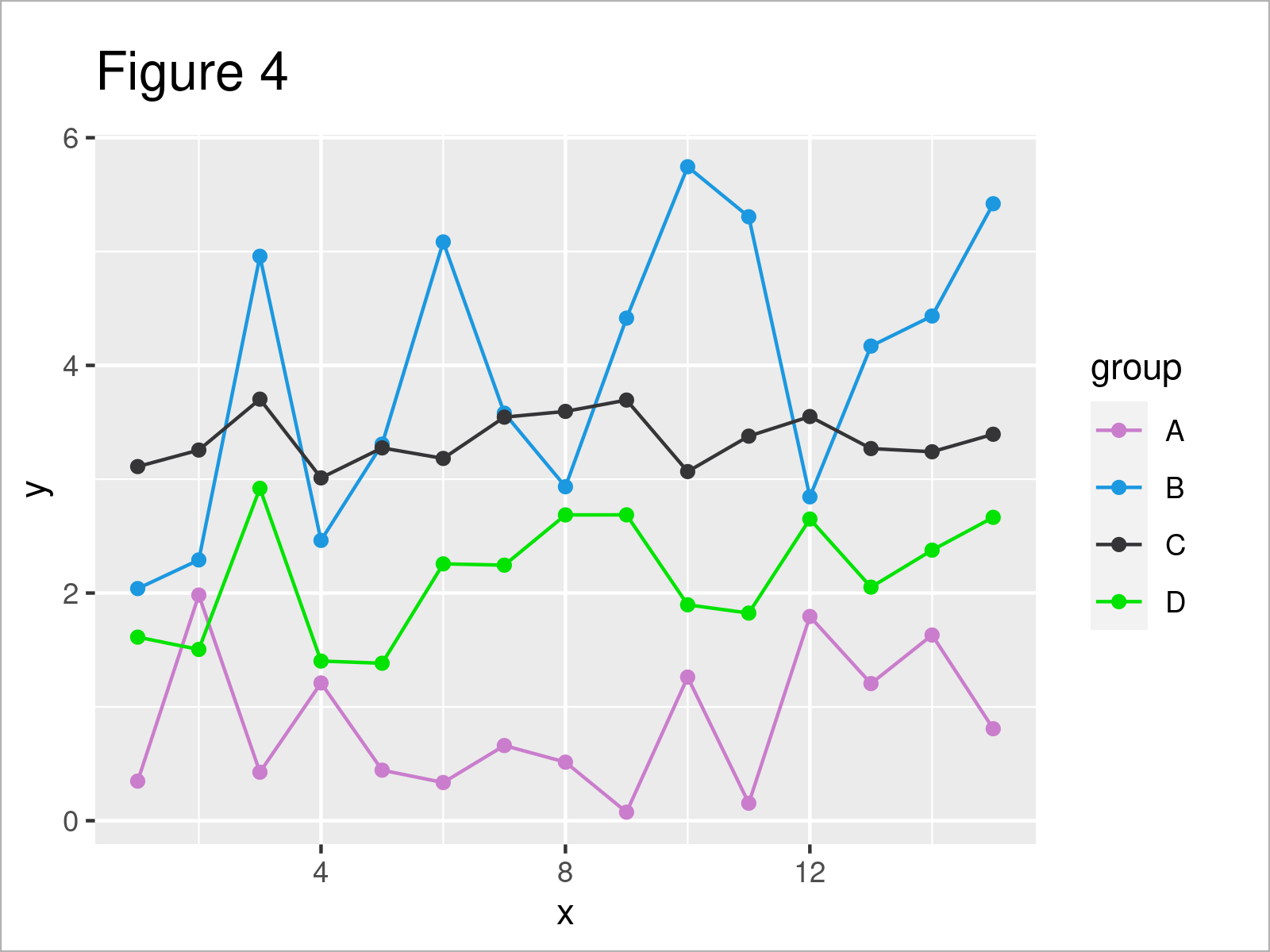
In this example, I’ll demonstrate how to set manual color codes for each group in a ggplot2 graphic.
For this task, we have to use the scale_color_manual function as shown below. Within this function, we can set a different hex color code for each group:
ggplot(
data,# Specify colors manually
aes(
x=
x, y=
y, col=
group
)
)
+
geom_line(
)
+
geom_point(
)
+
scale_color_manual(
values=
c(
"#ca7dcc"
,"#1b98e0"
,"#353436"
,"#02e302"
)
)
ggplot(data, # Specify colors manually
aes(x = x,
y = y,
col = group)) +
geom_line() +
geom_point() +
scale_color_manual(values = c(“#ca7dcc”,
“#1b98e0”,
“#353436”,
“#02e302”))
Example 4: Modify Fill Colors of Boxplots by Group
Until now, we have changed the colors in a ggplot2 line and point graph. This example illustrates how to modify the colors of a boxplot graphic.
For this, we can use the fill argument within the aesthetics of the ggplot function:
ggplot(
data,# Change colors of boxplots
aes(
y=
y, fill=
group
)
)
+
geom_boxplot(
)
ggplot(data,                    # Change colors of boxplots
       aes(y = y,
           fill = group)) +
  geom_boxplot()
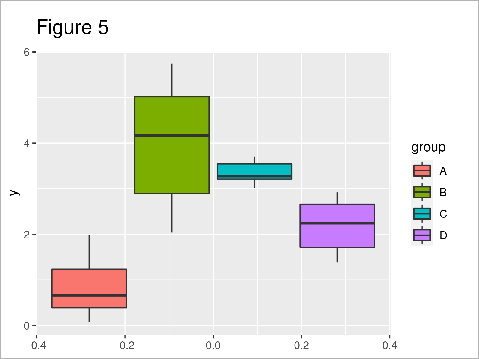
By executing the previous code, we have created Figure 5, i.e. several boxplots side-by-side where each box has a different fill color.
Video, Further Resources & Summary
Have a look at the following video which I have published on my YouTube channel. I explain the examples of this article in the video.
Please accept YouTube cookies to play this video. By accepting you will be accessing content from YouTube, a service provided by an external third party.

YouTube privacy policy
If you accept this notice, your choice will be saved and the page will refresh.
Furthermore, you might have a look at the other tutorials on my website.
To summarize: You have learned in this article how to set certain group colors in a ggplot2 graphic in the R programming language. In case you have any further questions, don’t hesitate to kindly let me know in the comments section.


