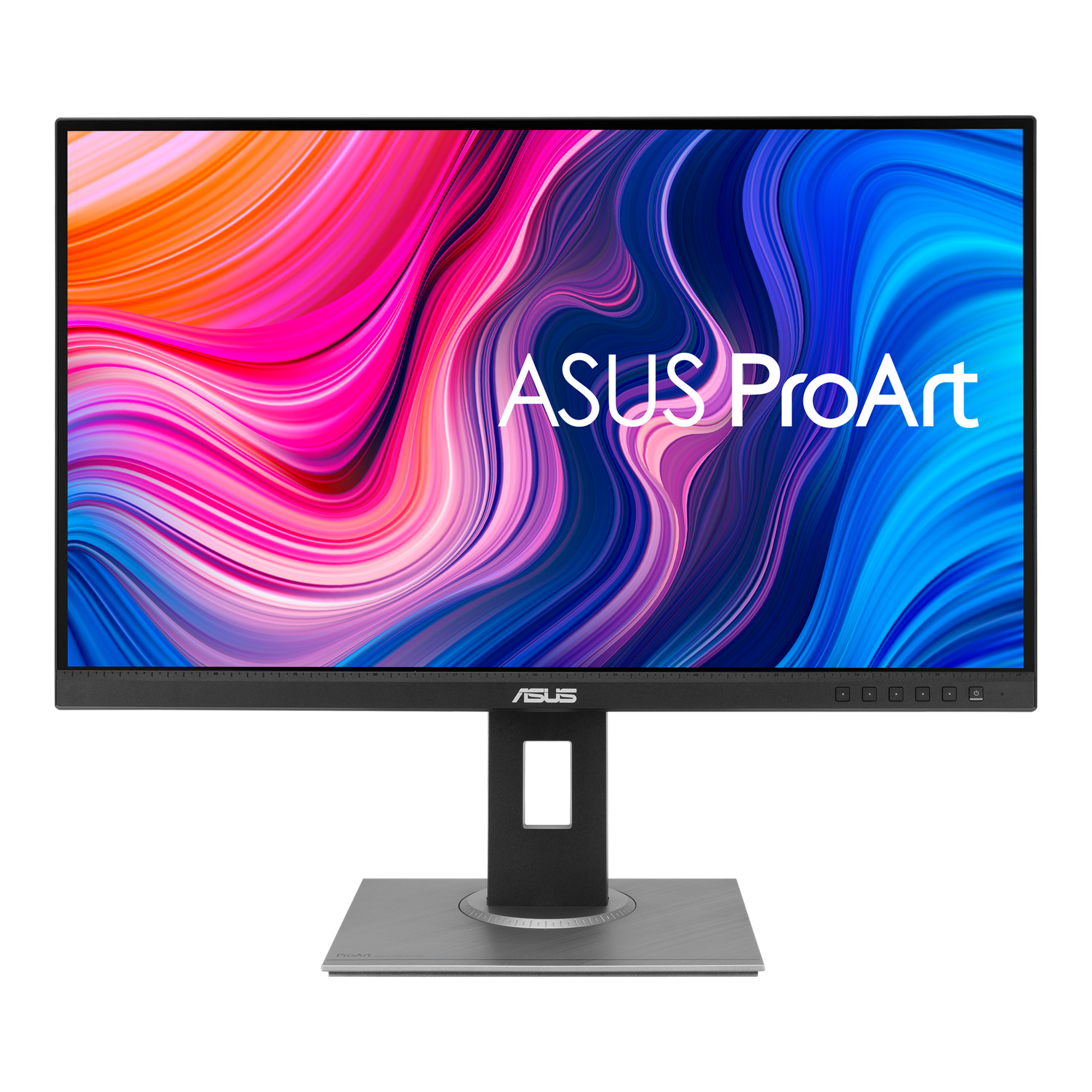
Graphic Designer Review: ASUS ProArt Display PA278QV
But the Dell was not taking advantage of my newer-technology Sapphire Radeon RX 580 8192 MB graphics card.
On October 5, 2020 I upgraded to an Asus PA278QV 2K monitor, as Asus calls it:
“ASUS ProArt Display PA278QV Professional Monitor – 27-inch, IPS, WQHD (2560 x 1440), 100% sRGB, 100% Rec. 709, Color Accuracy ΔE < 2, Calman Verified, ProArt Preset, ProArt Palette.”

ProArt Display PA278QV|Monitors|ASUS USA
The goal of the ASUS ProArt display series is to offer the most advanced technologies to power the imaginations of creators everywhere. With features such as mini-LED backlights, OLED displays, and ASUS Smart HDR technology, ProArt monitors are the solution for creating masterpieces.
OK, some key points to my review:
1) Previously, I was connecting over a DVI connection from my Asus motherboard hackintosh to the Dell monitor. The Asus monitor does not seem to recognize the DVI cable connection at boot and I get stuck on a black screen. However, the PA278QV works 100% over the HDMI connection booting via Clover bootloader. This is a difference, but not necessarily a problem.
2) Build quality of the Asus PA278QV seems comparable to the Dell. This feels like a decent, solid monitor without paying a lot of cash.
3) Onscreen, the 2K resolution feels like a bigger screen with slightly (fractionally) smaller GUI elements in the interface. Like the GUI elements feel 2% smaller at 2560 x 1440 than at 1920 x 1200. I don’t know if that math is exact but subjectively that is the feeling of viewing the screen.
4) There is a difference in color and contrast in the basic OS GUI elements. The ASUS colors in the GUI are more vibrant, intense, and slightly more contrast. It is all very legible and easy to read but feels more colorful than the Dell GUI colorspace.
5) Both the old Dell and this Asus have menus that allow you to customize and adjust and control color, brightness, contrast & etc. to what suits your working space and type of projects. These calibration tools are a little clunky and have some limitations, and no matter what you try you won’t exactly match the look of an Apple Retina display, but that’s actually fine. You don’t need that anyway — unless you are building Apple-branded GUI products.
6) This display feels like a good value. I like it. Works fine for 95% of graphic design and photographic jobs without the need for a 4K monitor. The only reason I might need a 4K monitor is if I was editing 4K video. (I’m not.) The only reason I might need a more expensive monitor is color-grading or print-proofing, but if you are printing a real physical object you’ll need to see physical color proofs no matter what.
7) I bought my display on Amazon for under $300.
I recently upgraded from my older Dell 24-inch UltraSharp PremierColor Monitor U2413. The old Dell was a very color-accurate expensive workhorse monitor in WUXA resolution (1920 x 1200.) It was great for accurate color especially in photos, web design, etc. The Dell display looked very faithful to pre-Retina Apple displays.But the Dell was not taking advantage of my newer-technology Sapphire Radeon RX 580 8192 MB graphics card.On October 5, 2020 I upgraded to an Asus PA278QV 2K monitor, as Asus calls it:“ASUS ProArt Display PA278QV Professional Monitor – 27-inch, IPS, WQHD (2560 x 1440), 100% sRGB, 100% Rec. 709, Color Accuracy ΔE < 2, Calman Verified, ProArt Preset, ProArt Palette.”OK, some key points to my review:1) Previously, I was connecting over a DVI connection from my Asus motherboard hackintosh to the Dell monitor. The Asus monitor does not seem to recognize the DVI cable connection at boot and I get stuck on a black screen. However, the PA278QV works 100% over the HDMI connection booting via Clover bootloader. This is a difference, but not necessarily a problem.2) Build quality of the Asus PA278QV seems comparable to the Dell. This feels like a decent, solid monitor without paying a lot of cash.3) Onscreen, the 2K resolution feels like a bigger screen with slightly (fractionally) smaller GUI elements in the interface. Like the GUI elements feel 2% smaller at 2560 x 1440 than at 1920 x 1200. I don’t know if that math is exact but subjectively that is the feeling of viewing the screen.4) There is a difference in color and contrast in the basic OS GUI elements. The ASUS colors in the GUI are more vibrant, intense, and slightly more contrast. It is all very legible and easy to read but feels more colorful than the Dell GUI colorspace.5) Both the old Dell and this Asus have menus that allow you to customize and adjust and control color, brightness, contrast & etc. to what suits your working space and type of projects. These calibration tools are a little clunky and have some limitations, and no matter what you try you won’t exactly match the look of an Apple Retina display, but that’s actually fine. You don’t need that anyway — unless you are building Apple-branded GUI products.6) This display feels like a good value. I like it. Works fine for 95% of graphic design and photographic jobs without the need for a 4K monitor. The only reason I might need a 4K monitor is if I was editing 4K video. (I’m not.) The only reason I might need a more expensive monitor is color-grading or print-proofing, but if you are printing a real physical object you’ll need to see physical color proofs no matter what.7) I bought my display on Amazon for under $300.


